-
RoleProduct Designer
-
Year2024
-
CategoryDeveloper Tools / Low-Code
Bitloops
The co-pilot that bridges the gap between Figma and production-ready React code.

Context & Product Definition
Bitloops is a VS Code extension that instantly converts Figma designs, even messy, unstructured ones, into clean, responsive React components. It goes beyond simple code generation by automatically creating Storybook stories and Cypress tests.
The Goal: To eliminate the repetitive grunt work of frontend development (slicing, CSS tweaking) and allow engineers to focus on logic and architecture. It empowers developers to treat Figma as a source of truth without requiring designers to change how they work.
The Challenge (UX Analysis)
The industry suffers from a broken "Hand-off" process.
- Designers rarely structure Figma files like code (autolayout is often broken or missing).
- Existing tools (like Anima or Builder.io) require designers to work like developers. If the input isn't perfect, the output is "spaghetti code" that developers refuse to use.
- Developers hate leaving their IDE (VS Code) to check a browser tool.
- Developers were spending 40% of their time just translating pixels to CSS and writing boilerplate tests, rather than building features.
The Solution
We pivoted away from a "No-Code" web platform and moved directly into the developer's habitat: The VS Code Extension. Instead of forcing designers to code, the workflow was designed to interpret the visual intent. The UX is built around "Trust but Verify", giving developers full control to inspect and modify the generated code before committing.
Key UX Wins:
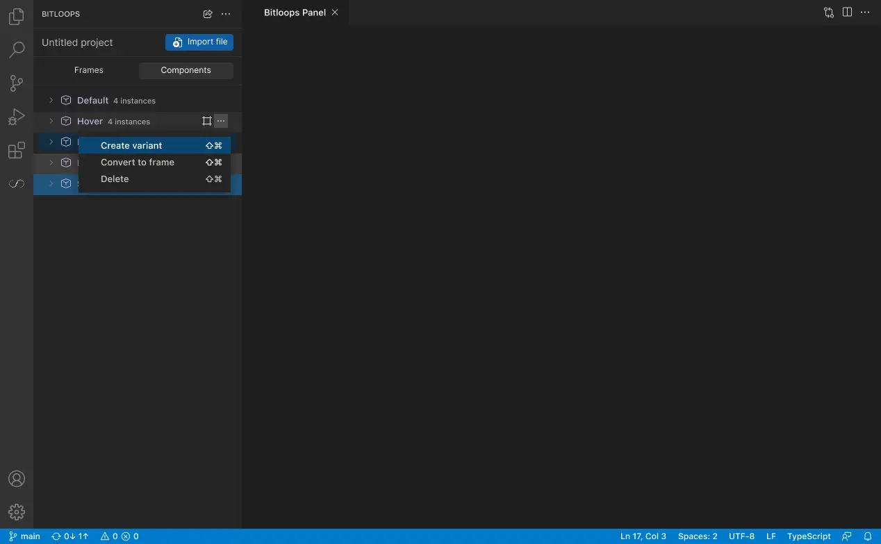
- Native Integration: The UI lives inside the VS Code sidebar, respecting the developer's existing environment and theme.
- The tool automatically detects messy Figma layers and virtually "cleans" them before generating code, meaning the user doesn't have to fix the design file first.
- Bitloops doesn't just give HTML/CSS; it generates the ecosystem (Storybook + Cypress), which builds immense trust with senior engineers.
App Architecture
The architecture follows a Linear Pipeline Flow:
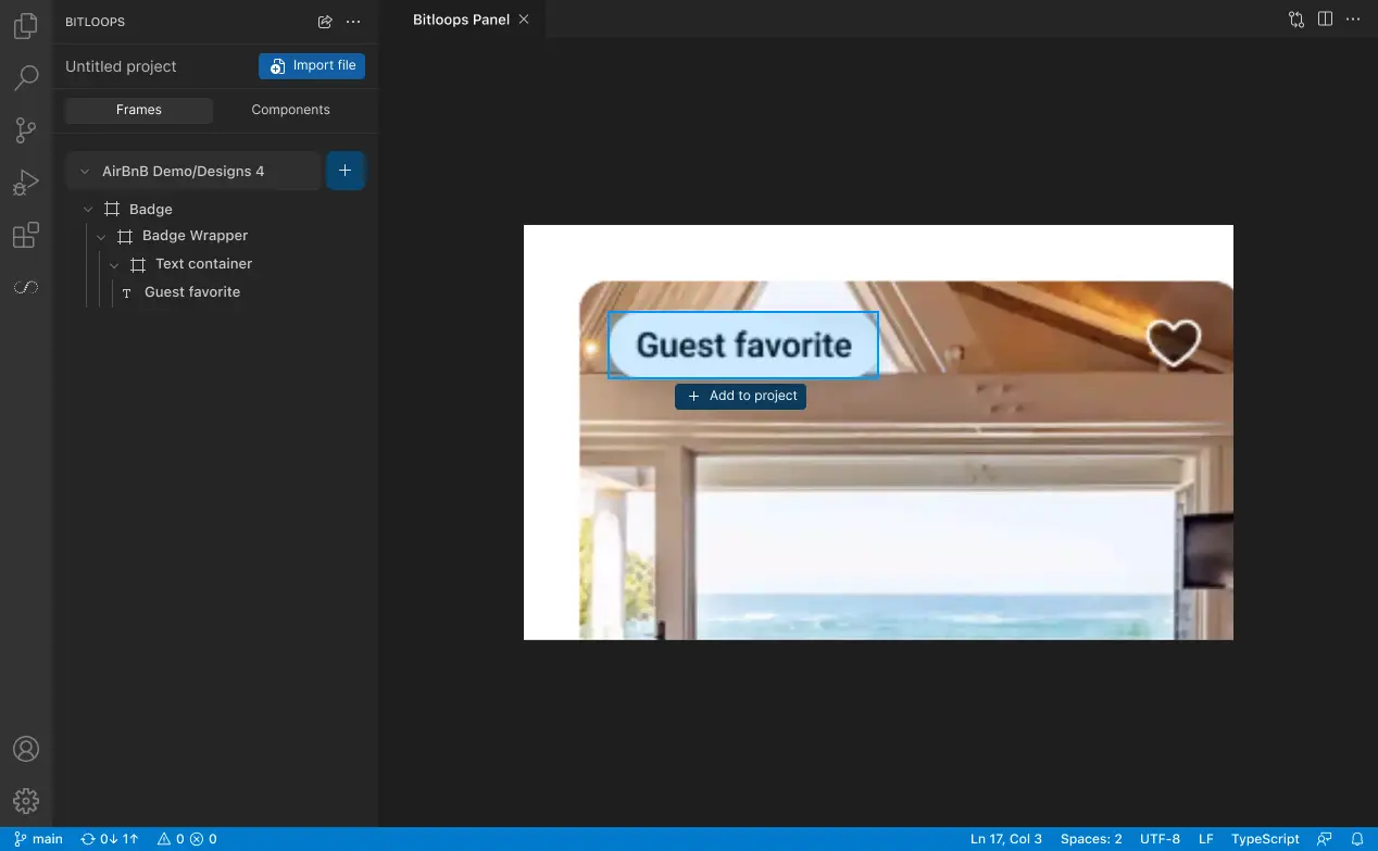
.1 - Input Node: Figma URL / Frame Selection.
.2 - Processing Layer: The "Black Box" where design tokens are extracted and normalized.
.3 - Output Interface (VS Code):
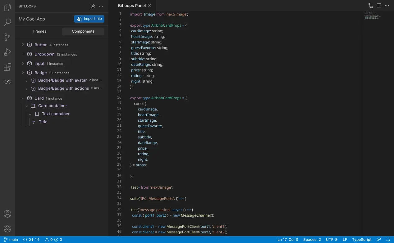
.4 - Renders the component live.
.5 - Code Tab: Shows the React/TSX code (Editable).
.6 - Test Tab: Shows the generated Cypress code.
Materials Used (UI & Design System)
Designing for Developers:
Color Palette: "IDE Dark Mode." Backgrounds: Deep Gunmetal and Jet Black (to match VS Code default themes). Accents: Syntax-highlighting colors (Electric Blue for functions, Neon Green for strings, Amber for warnings).
Typography: A pairing of Inter (Interface UI) and Fira Code (Code snippets). We used a dense type scale (11px - 13px) to maximize data density.
Components: Custom "Code Snippet" cards, diff-view toggles (Before/After), and terminal-style status indicators.