-
RoleHybrid Product Designer
-
Year2015 - 2018
-
CategoryMedia, Digital news
El Español
Building the design infrastructure for Spain's leading digital-native news platform.
Project Overview
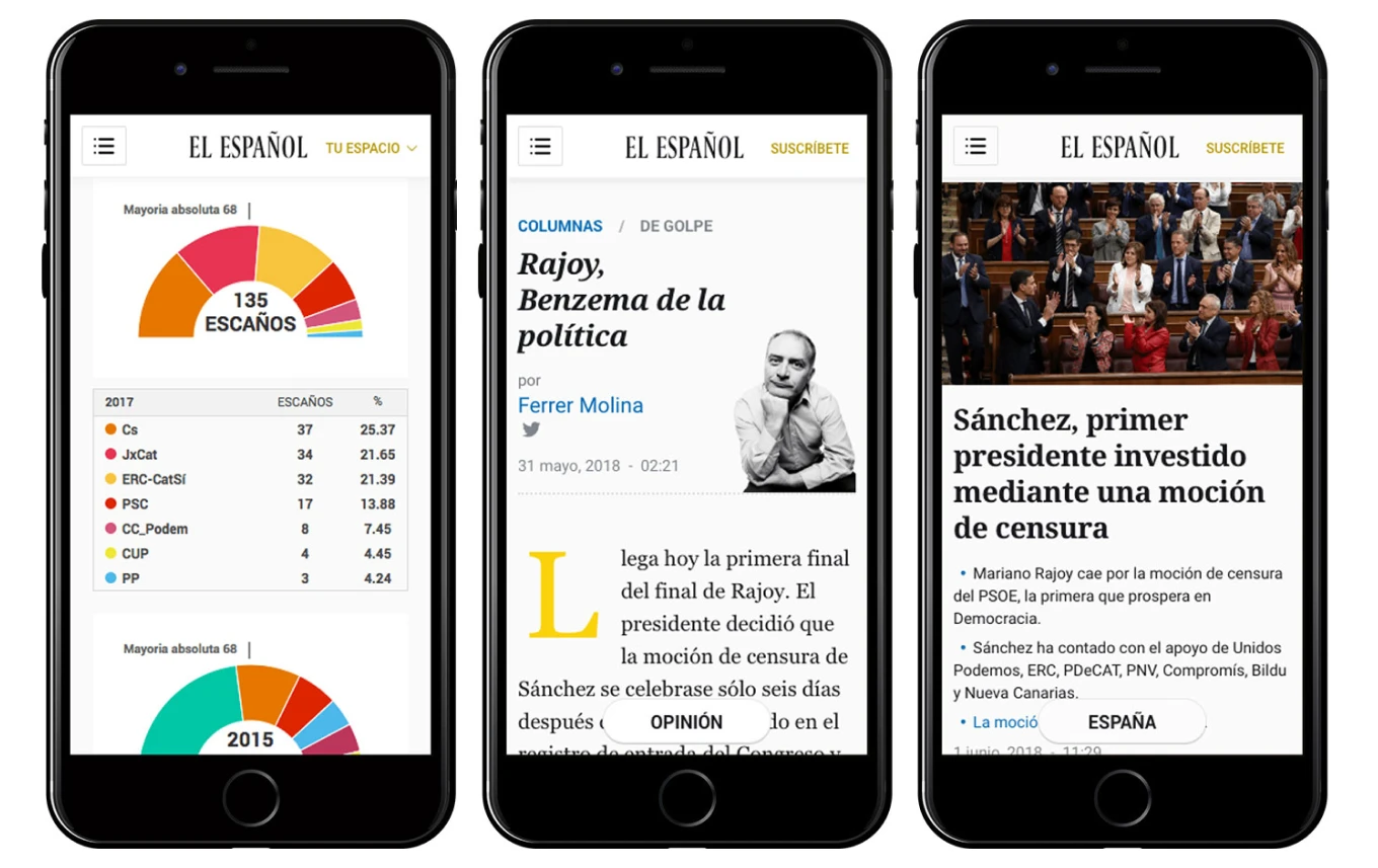
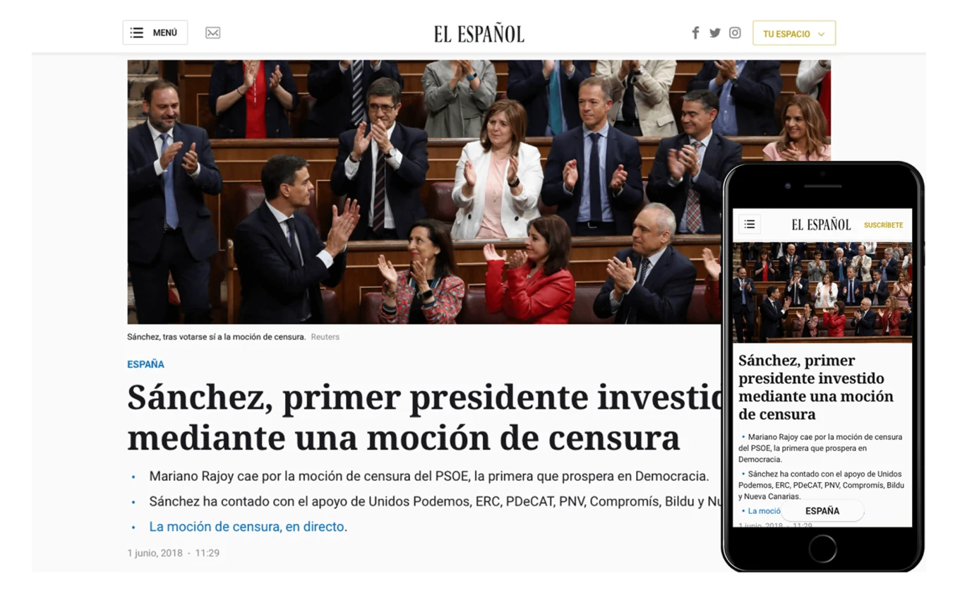
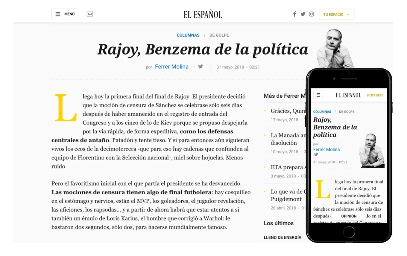
El Español is a 100% digital media outlet that disrupted the Spanish news market. As a native digital product, our competitive advantage against legacy newspapers relied entirely on user experience: speed, mobile-first responsiveness, and a premium reading interface.
Design a subscription-worthy experience
Moving users from free readers to paid subscribers required an interface that communicated trust, quality and exclusivity.
My Role: Hybrid Product Designer
I operated as a true "Hybrid Designer," bridging the gap between the creative team and engineering. I didn't just hand off mockups; I integrated directly into the development workflow, writing code and managing repositories.
The Challenge: Scaling Without Resources
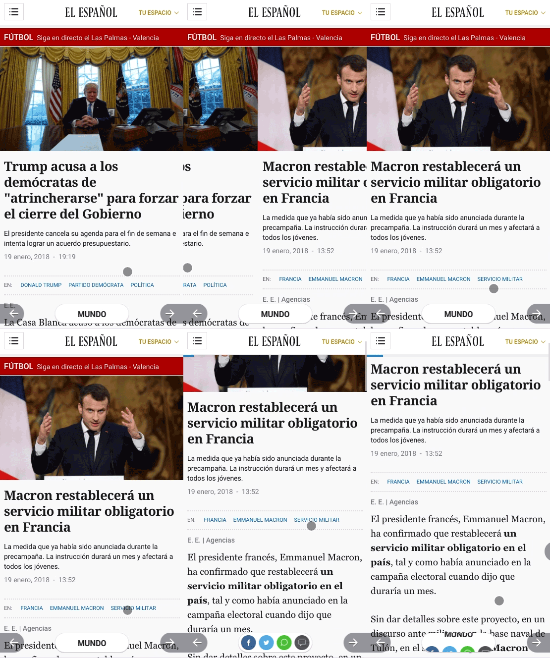
In 2015, the design team was too small to handle the volume of daily news requests. We faced a bottleneck:
- We were rebuilding the same UI elements (buttons, cards, headers) repeatedly.
- Without a shared language, the "mobile-first" experience was fragmenting across devices.
- The news cycle is instant. We needed a workflow that allowed us to ship features in minutes, not days.

The Solution
- I identified that most design requests were actually variations of existing patterns. This insight launched the company's first Design System.
- 1. The Audit & Documentation I led the initiative to collect, standardize, and document all UI elements. We moved from designing unique pages to assembling pages from approved components.
- 2. Architecture as Code (SASS) This is where I went beyond traditional design. I architected the SASS file structure to match the visual Information Architecture.
- I wrote and managed the CSS/SASS code to ensure that the "Design System" wasn't just a Sketch file—it was live production code.
- I worked side-by-side with frontend engineers in Git, ensuring the bridge between design intent and browser rendering was flawless.
UX Strategy: Lean & Data-Driven
We implemented a Lean UX process to validate ideas quickly.
Collaborative Loops: Worked directly with SEO experts and Data Analysts to base design decisions on real traffic metrics.
Rapid Prototyping: Used Sketch for high-fidelity UI and Origami Studio for complex interaction flows to test concepts before writing a single line of code.
Impact
- Drastically reduced "pixel-pushing" time, allowing the team to focus on feature strategy.
- Established a single source of truth that lived in both the design tools and the codebase.
- Built the infrastructure that allowed El Español to scale into one of the most read digital newspapers in Spain.