-
RoleProduct Designer
-
Year2014 to 2015
-
CategoryMedia, Communication, Digital news
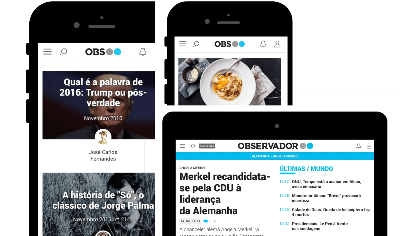
Observador
The look and feel of a modern online product was carefully planned to be combined with a clean and simple design
The challenge
In the technology-driven year of 2014-2015, a lot of News pages did not keep up with the technology revolution. Their visuals had been the same for years and, in addition, they had not adapted their expertise to the new smart gadgets. Disruptive digital merchandise were required to operate on any device, at any time, in order to accomplish a great human-machine interaction.
Design process
The global plan of action is a logical and meaningful culmination of the current good practices with an efficient thinking process. Design process was organized like this:
Human centric
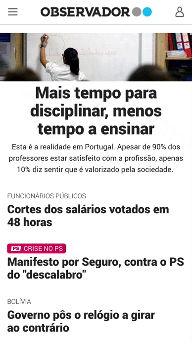
The project prioritised mobility and flexibility, which were at the core of every decision. It was aimed at being accessible to young or old people, and being mobile-first, fully responsive, and accessible to all users. The choice of a priori premises reflected the project's initial ambitions.
Methodologies
Methodologies like Desk research and Benchmarking were being constantly used to research the market and the competitors. Finding the right UI elements and the UX is a crucial step to counterbalance Observador’s editorial position. Opinion pages were designed with those methods in mind, they contain important issues written with the right balance of fact, analysis and a touch of irony or humor sometimes.
Visual consistency
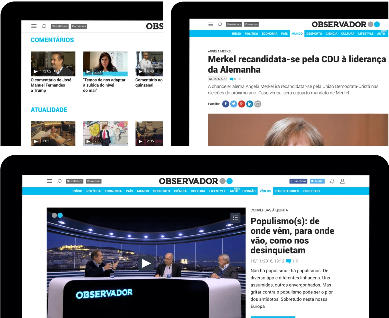
A 12 column layout was used for mobile, tablet and desktop devices. To calculate the optimal number of columns, the vertical rhythm, the fixed or responsive grids, the gutters/margins and so on, … I’ve researched a lot on how to achieve a visual system that would look harmonious and won’t make users think when making a decision. To help me achieve the final results, Sketch (2014/2015) helped me a lot and since then has been my most used design tool.
Design, front end and back end
At Observador both professionals were always working side by side and sharing knowledge. I had the opportunity to do code and developers were always helping with the design decisions and user experience. We were a really small team at that time and in my case thinking in CSS while doing my designs helped me a lot with limitations and constraints.
Technology
Runs on Wordpress and another powerful open source technologies. In less than a year won the award for the “Best news media website” in the country and after a few more awards was mentioned by the Wordpress community as "A case study around the world" for its very impressive architecture.