-
RoleHead of Design
-
Year2021 - 2023
-
CategoryWeb3
Metallicus
Building a bridge between Traditional Finance and the Web3 economy.
Context & Product Definition
Metallicus is a fintech powerhouse building a fully integrated ecosystem of digital asset products. Unlike isolated crypto apps, Metallicus bridges the gap between traditional banking (Fiat) and decentralized finance (DeFi) through a Layer 0 blockchain and a suite of consumer applications.
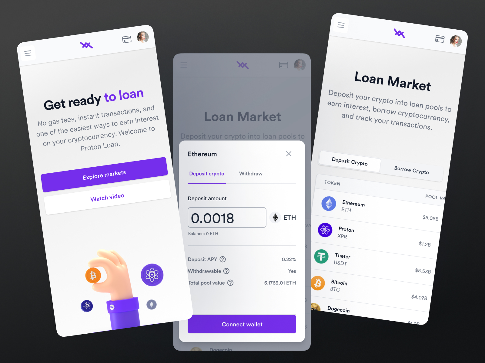
I oversaw the design of 8+ interconnected products, including MetalPay (Consumer Crypto Wallet), Proton Dex (Professional Trading), WebAuth (Identity Wallet) and Proton Loan (DeFi Lending).
To make Web3 accessible, compliant and safe for the mass market while providing powerful tools for crypto-natives.
My Role & Evolution
Started by executing hands-on UI/UX for the core wallet experience, then took ownership of product design strategy and established the first design system.
Built and led the design team. Responsible for the holistic user experience across the entire ecosystem, Design Operations (DesignOps) and unifying the visual language across 8+ distinct products.
The Challenge (UX Analysis)
We had 8+ products (Consumer vs. Pro / Web vs. Mobile). Without a strong system, they risked looking like 8 different companies.
Web3 is inherently complex (keys, gas fees) and Metallicus is heavily regulated (KYC/AML). The UX had to hide the blockchain complexity while highlighting the compliance safety.
To encourage mass adoption, the interface couldn't look like a cyberpunk tool. It needed the polish and reliability of a neobank (like Revolut or N26) combined with the power of DeFi.
The goal was to "Facilitate Web3 adoption by removing the friction of fear.
The Solution
Instead of forcing one visual style on everyone, created a Unified Core System that allowed for distinct personalities:
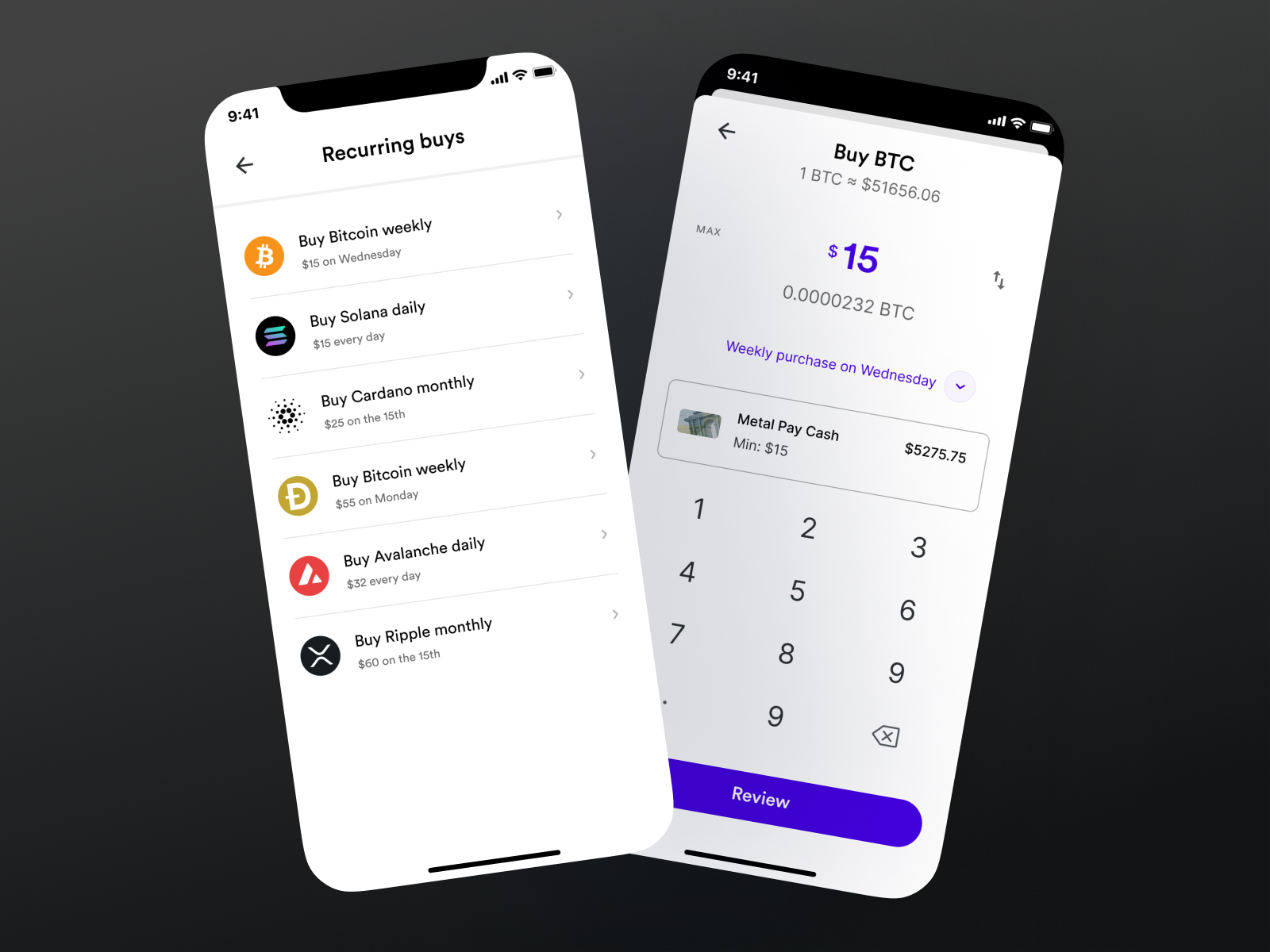
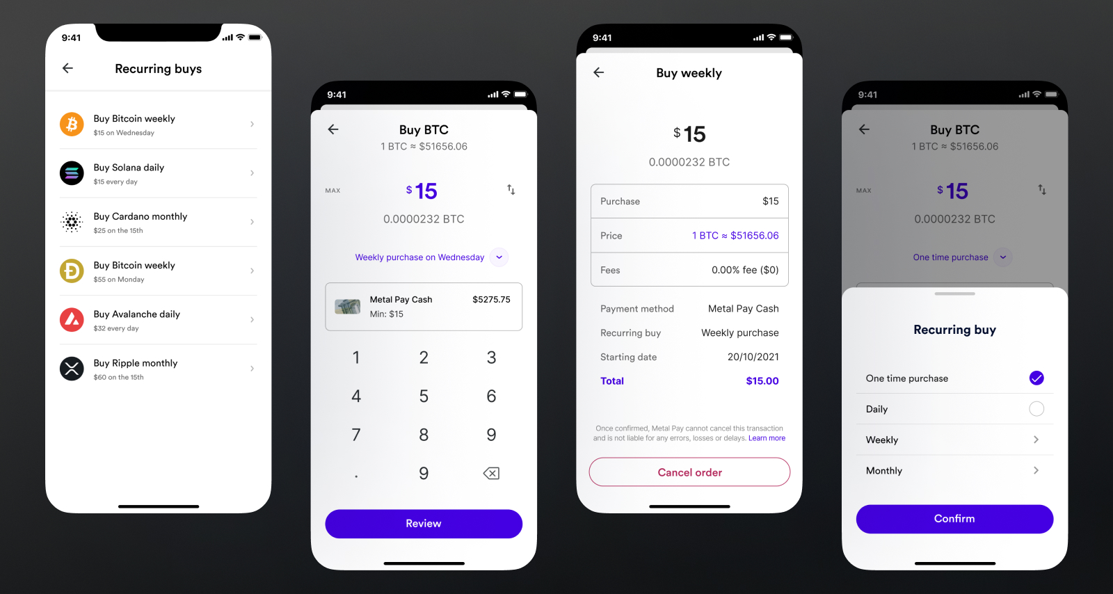
- MetalPay: Designed for the Consumer. Friendly, colorful, rounded, and simple. Focused on "fun" and social payments.
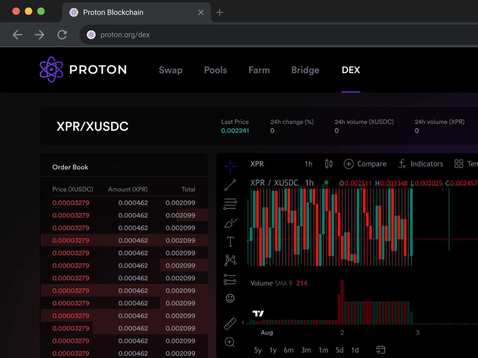
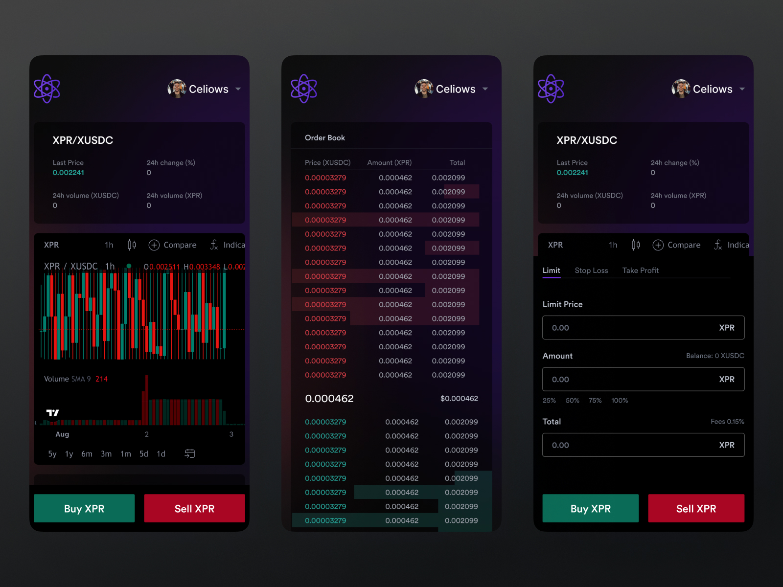
- Proton Dex/Loan: Designed for the Trader. Dark modes, high data density, technical charts and precision. Focused on speed and information.
Key UX Wins:
.1 - Human-Readable Identity: We replaced complex wallet addresses (0x7e2...) with simple @names (e.g., @celio), making the ecosystem feel social and safe.
.2 - Identity (WebAuth): Designed a seamless SSO (Single Sign-On) experience where one digital identity allows access to every product in the ecosystem.
Design Process & Management
As Lead Designer, my brain had to shift constantly from pixels to people and processes.
.1 - Discovery & Research: I led the team in mapping user personas, differentiating between the "Crypto Curious" (MetalPay users) and the "DeFi Degens" (Proton users) to tailor interfaces for each.
.2 - Design Ops: I established the workflows that allowed us to adhere to ambitious timelines. This included weekly design crits, developer hand-off protocols and unified tooling (Figma).
.3 - Strategy: Worked directly with the C-Suite to define how new products (like Proton Loan) would fit into the existing navigation and ecosystem without causing bloat.
Main Features (The Ecosystem)
MetalPay (Mobile App):
- Feature: Recurring Buys. A "Set and Forget" flow allowing users to automate investment.
- Feature: Social Payments. Sending crypto to friends as easily as sending a text message.
Proton Dex (Web App):
- Feature: Professional Trading Interface. A high-density dashboard featuring real-time Order Books, Depth Charts, and Trading History.
WebAuth (Identity):
- Feature: Biometric Signing. Replacing password fatigue with FaceID/TouchID for blockchain transactions.
Ecosystem Architecture
The architecture is built on a Hub and Spoke model:
The Hub (WebAuth): The user's Identity and Private Keys. This is the passport to the ecosystem.
The Spokes (The Apps):
MetalPay: The Fiat On-Ramp (Bank $ → Crypto).
Proton Swap/Dex: The Exchange (Crypto → Crypto).
Proton Loan: The Bank (Lending/Borrowing).
Materials Used (Design Systems)
Managing 8+ Products with One Core
To manage this scale, I oversaw the creation of a Multi-Brand Design System.
The "Core" Library: A shared repository of functional atoms (Inputs, Buttons, Toggles, Modals) that ensured interaction consistency. If you knew how to use MetalPay, you intuitively knew how to use Proton Loan.
The "Theme" Layer:
Metal Brand: Vibrant gradients, soft shadows, rounded typography (Circular/Geometric).
Proton Brand: Technical aesthetic, deep purples/blacks, monospaced data fonts, sharp edges.
Component scalability: We designed components to be "responsive by default" to handle the transition from complex desktop trading views to mobile wallet views.
Conclusion & Impact
Metallicus was a masterclass in complexity management.
We successfully launched and maintained 8+ products using a unified design team and system. We helped transition users from traditional banking to Web3 by hiding the technology behind a beautiful, compliant interface.
I left behind a mature design culture and a robust design system that allows the company to continue shipping features at speed.