-
AuthorCélio Pires
-
Published2025
-
CategoryDesign Systems
Creating and scaling design systems
I've worked on a bunch of products over the years and most of them had the same issue. As teams grew the UI started to drift. One team shipped something new, another team updated an old screen, someone copied an old button from a file from 2019… you know how it goes. A design system became the only way to keep things clean and predictable.
Why the system was needed
Across projects like El Español, Telefónica, Commons or Metallicus the patterns were always the same:
• components duplicated in random places
• design choices changing from team to team
• engineers rebuilding the same UI again and again
• reviews taking forever because nothing matched
• design debt piling up quietly
So the system wasn't just a "nice tool". It was the thing that stopped the chaos.
My role
I usually took the lead on defining the structure, building the core components, getting teams aligned, making sure the system didn't die after two months.
Honestly half of the job was communication. The other half was Figma.
How I structured the system
The approach changed a bit depending on the product size but the base looked like this.
1. Tokens and foundations
I always started with the basics. Design System principles, spacing, colours, typography, grids, borders.
Then the accessibility part came in right away because it’s not something you “add later”. Contrast ratios that actually pass, font sizes that don’t force people to zoom, line heights that stay readable, touch targets that meet standards.
If these weren't stable nothing else would work.

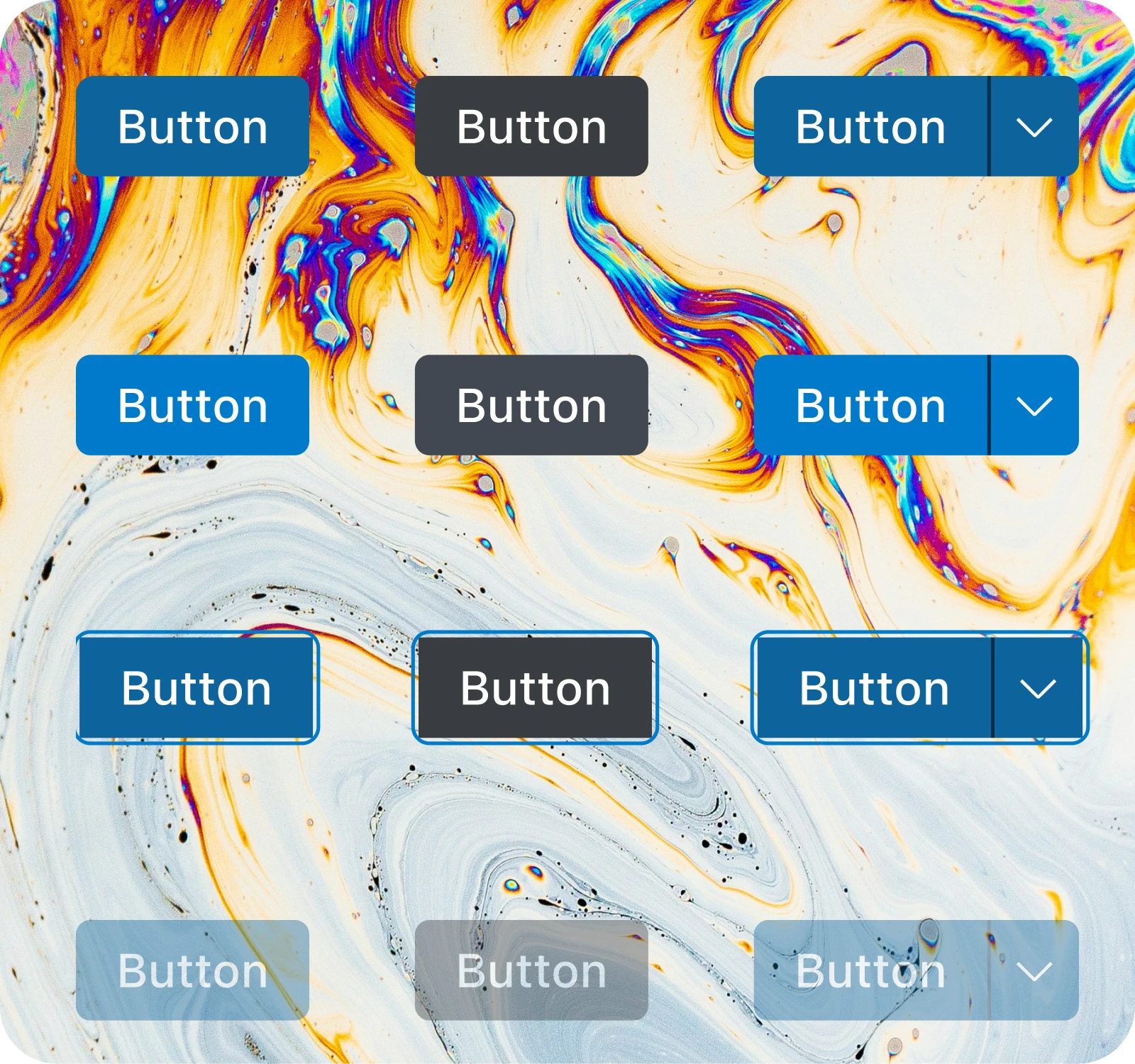
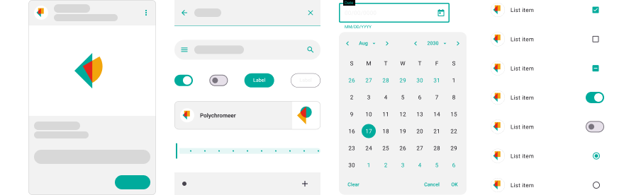
2. Core components
Buttons, inputs, dropdowns, cards, navigation.
Clean naming, predictable logic and variants that matched real use cases instead of imaginary ones.
On El Español I even pushed for a BEM-style naming convention which helped designers and engineers speak the same language. It kept components consistent and made the whole system easier to scale across teams fast workflow.

3. Patterns
For bigger products like Telefónica or Metallicus I added patterns on top.
Forms, filters, tables, dashboards.
These were the pieces teams used every day so getting them right saved a lot of headaches. I also made sure the patterns weren’t just pretty but actually worked with real data, edge cases and weird states that only show up in production. This is the level where teams start saving time.

4. Documentation
For teams like Metallicus and Commons I worked closely with developers to map Figma structure into their world.
Even when the company didn't use Storybook the goal was the same: predictable components that engineers could rely on.
5. Engineering alignment
Every component came with clear usage notes.
When to use it, when not to use it, behaviour rules, accessibility basics.
Some of the most commons tools to keep the documentation updated were:
• Figma (for Bitloops, Commons, Sphera)
• Zepelin Docs (for Telefónica)
• Confluence (for Talkdesk)
• Sketch Cloud (for El Español)
Scaling the system
Once the first version existed the real work began. Different products needed different plans.
• For smaller teams a simple library and a short guide was enough
• For bigger ones I created a migration plan, support sessions, deprecation process and a feedback loop
Getting buy-in
I showed teams before and after implementing the system how much pain it removed:
• fewer inconsistencies
• faster development
• shared vocabulary
• easier onboarding
• fewer UI bugs
Once people realised it actually made their life easier adoption happened on its own.
Rollout
Different products needed different plans.
• For smaller teams a simple library and a short guide was enough
• For bigger ones I created a migration plan, support sessions and a feedback loop
Keeping it alive
A design system dies fast if nobody takes care of it.
So I added a small routine of reviews:
• check new components
• audit the library
• clean duplicates
• refactor when the product changed
Nothing fancy. Just consistent care.
Examples from past projects
Without showing any private UI here's the type of work I did:
• El Español: foundations and reusable pieces for a fast newsroom workflow
• Telefónica: scaled the system across multiple products and teams
• Clutch: built tokens, core components and the early documentation
• Metallicus: created patterns for complex admin flows and aligned design and engineering so components behaved the same in Figma and in code
• Bitloops: helped structure a system that supported a product with heavy engineering needs
• Sphera: cleaned patterns and unified behaviours across different parts of the platform
Impact
The results were pretty consistent:
• faster feature development
• fewer inconsistencies
• fewer redesigns
• less engineering time wasted
• predictable UI
• smoother onboarding
Sometimes the number of UI bugs dropped.
Sometimes designers stopped recreating the same stuff every week.
Sometimes both.
What I learned
A design system is not just components.
It's alignment. It's clarity. It's teams agreeing on what "good" looks like.
The structure matters but adoption matters more.
If people trust the system everything else is easier: design, code, decisions, releases.
Latest Articles
Insights and learnings from building design systems across different products and teams.View all articles